


Simon Lancaster assesses student evaluation in higher education
![Student evaluations shutterstock 298782377 300tb[1]](https://d1ymz67w5raq8g.cloudfront.net/Pictures/480xAny/6/2/9/113629_studentevaluations_shutterstock_298782377_300tb1.jpg)
I once remarked that 99% of all student course evaluations were a waste of time. Of course I made that value up – the real figure is probably much higher.
What’s my problem with student evaluations? I should probably point out that it’s not sour grapes: I’m happy to share evaluations of my own teaching by our second year inorganic chemistry students below (Figure 1).
In that data set our students are replying to a question inspired by the National Student Survey (NSS), ‘The lecturer responded well to student needs at an individual and group level.’ It’s important to note that they are actually asked whether they strongly disagree, disagree, are neutral, agree or strongly agree. They are not being asked to rank me on a scale from 1 to 5. Nevertheless, the practice of mapping these labels to the numerical values is ubiquitous.
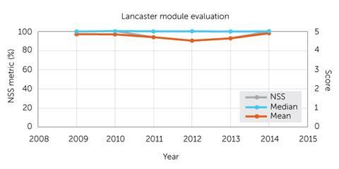
This is where the problems start. These are labels, not numbers – it is meaningless to average them. If half your students have black hair and half are blonde would you then conclude that the average hair colour is brown? Why then have I included the mean in the figure? So I can demolish it later.
The practice in many institutions has been to revise their module evaluation instruments to look ever more like the NSS. Whatever criticisms we might have of the NSS, its significance in higher education is unquestionable. However, the data we receive from it is not expressed as a number between 1 and 5, instead it is presented as a percentage.
The percentage value is the number of students selecting agree or strongly agree to the question being posed (which we will refer to as the NSS metric). There is no distinction between the two labels. Whatever we may think about the discernment of this measure at least it does not involve the ‘averaging’ of labels.
A case study
Looking at Figure 1, the median doesn’t change and the maligned mean tracks the NSS. So, is the mean a good proxy for the NSS metric?
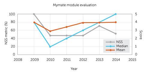
Let’s examine another set of evaluation data, this time for my fictional colleague Prof Mymate (Figure 2). Over the years Mymate has become a really polarising character, loved by half the students but not the rest. In 2009 every student agreed that the Prof responded well to student needs and their average median and mean was 4, while the NSS metric was a perfect 100%. By 2014, the Prof was getting strongly agreed from just over half the class – a median of 5. Their mean had even crept up to 4.04. But by the one metric to rule them all, the NSS, their record had plummeted to 52%.
Any kind of averaging does not work when what we are actually looking at are very different labels.
My evaluation results look pretty good. The median response is always that students strongly agree that I am responsive. Always. But over the last 5 years, as has been documented in articles in Education in Chemistr y, my practice has changed dramatically through screencast lecture capture, to flipping, to peer instruction on this module. What can I learn from this?
There is a central tenet of data analysis: the purpose is to yield actionable insights. And I have none.
Making a distinction
Returning to the NSS for a moment, the headline measure of overall satisfaction bunches many higher education institutions in the 90s. Can we seriously differentiate excellence on the basis of a handful of students choosing between neutral and agree?
Module evaluations aren’t completely without merit. The qualitative free-text fields can provide the actionable insights we crave. But you can’t rank on qualitative statements.
Top image © Shutterstock


1 Reader's comment