


Students can struggle to see why their smudgy data points clustered in a graph’s corner needs improvement. Fraser Scott suggests simple steps to turn your class into scale-selecting experts
Students will often present you with a graph showing the entire data set plotted in one corner of the graph paper, with several data points coalescing into an imprecise smudge. Not only do students struggle with selecting appropriate scales, they often can’t evaluate the scale they have chosen, making self-correcting difficult. This isn’t surprising, as they only ever see well-chosen scales in the resources used to teach them.
Graph drawing takes up so much teaching time that it is avoided for anything but analysing data from a class experiment. However, students’ lack of practice could add to their difficulties. I help students choose appropriate scales by first simplifying and scaffolding the task.
Scale back the problem
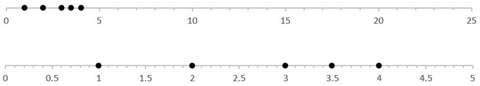
I begin by removing the extraneous details: context, units, and axis labels. Moreover, I use a 1D dataset, so there is only one scale. Rather than students choosing a scale and plotting the points, I first focus them on evaluating existing scales.
For example, show students a 1D graph with an appropriate scale and one with the same data but an inappropriate scale and ask them, ‘Why is the scale in the first graph more appropriate than the scale in the second graph?’
Following this, model the process of selecting an appropriate scale by using multiple examples. This provides the opportunity to demonstrate there is not necessarily one correct answer. Moreover, it is important to show the difficulties with drawing a graph using a poorly chosen scale, and to illustrate the moment when you might consider choosing an alternative scale.
I like to give students the following tips when demonstrating selecting an appropriate scale:
- Try to make the graph fill most of the space, using a break in the axis scale if appropriate. (For 2D dat sets, examine both landscape and portrait graph paper, if possible.)
- To make the divisions on an axis easy to plot, factors of two or five are probably best.
- It can be difficult to know if the scale you’ve chosen is appropriate until you start drawing the graph. If it’s difficult to plot the points, there is no need to persevere – it is OK to start again.
Before letting students loose to select their own scales, provide a scaffolded activity. Present a few examples of data sets with already plotted graphs, and have students decide if they are appropriate or not. For those that are not appropriate, have them re-plot the data using a more appropriate scale. I find for these latter examples, having the data already visualised helps students to select more appropriate scales for the dataset.

Evaluate the scales
Download this worksheet (MS Word or pdf) for students to practise evaluating scales, and redrawing inappropriate ones. Create more 1D graphs with a variety of datasets and scales using this plotter (MS Excel).
Download a worksheet from the Education in Chemistry website for students to practise evaluating scales, and redrawing inappropriate ones, and create more 1D graphs with a variety of datasets and scales using the excel graph plotter: rsc.li/2BfaozY
Students can then be allowed to plot 1D datasets by themselves.
Finally, the whole process can be repeated for 2D datasets. Having thoroughly practised with 1D data, students find it easy to adapt to 2D data plotting without much more explicit instruction.
Only once students are able to deal with plotting points of unitless, context-free datasets, would I then introduce the need for graph and axis titles, and appropriate presentation of units.
Fraser Scott
Downloads
1D graph plotter
Excel, Size 73.5 kbEvaluating scales worksheet
PDF, Size 85.27 kbEvaluating scales worksheet
Word, Size 0.11 mb


1 Reader's comment