Graphs, tables and bar charts help teach mathematical functions that describe chemical phenomena. Fraser Scott explored why some representations may be more effective than others
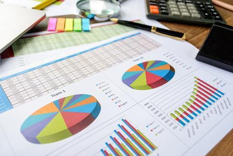
Data can be represented in a variety of ways. Graphs may be useful for a qualitative examination of data, whereas tables may be more useful for obtaining values to perform subsequent calculations.

In chemistry we often use data representations to explore the mathematical functions that describe chemical phenomena, such as the linear relationship between heat and temperature change in the thermochemical function q = m × Cs × ΔT (where q is heat, m is mass, Cs is specific heat capacity and ΔT is temperature change). Knowing about the strengths and weaknesses of data representations is important to ensure our students understand the concepts we are trying to convey using them.
In a new study, Tobias Rolfes and his colleagues evaluated different representations of data for their effects on students’ performance solving problems involving functions. The team were interested in how data representations can influence students’ understanding of the concept of a mathematical function. However, their findings are also applicable to understanding functions in science.
The researchers tested several hundred 12–13 year olds in a number of German secondary schools. Each student completed 36 questions covering a variety of types of function and three data representations: tables, graphs, and augmented bar charts. In a conventional bar chart the values must be read from the axis, but in an augmented bar chart the values are displayed above the bars. Therefore, the augmented bar chart combines some features of tables and conventional bar charts.
The results showed that students found carrying out function tasks most difficult when data were presented in the form of a graph. There was no difference in performance between data presented as a table or an augmented bar chart.
If the function task could be solved qualitatively, by merely inspecting the data, then data presented as a graph was just as effective as a table. However, if more than just a glimpse of the structure of the graph was necessary to solve the problem then a table was better.
It is useful to frame these results within the context of cognitive load theory, which suggests the representation that is easiest to interpret allows for more working memory to be devoted to learning gains. So, this implies tables or augmented bar charts are more effective than graphs for learning function-based concepts.
Teaching tips
While interpreting graphs is an essential skill students need to master, be aware that it might distract students from learning underlying concepts. Consider these observations and strategies:
- Extracting values from a graph adds an additional step in any quantitative reasoning task. Consider providing a table of the data alongside the graph.
- Foster students’ metacognitive awareness by explicitly teaching them that extracting information from graphs is error-prone. Encourage them to check they have extracted the correct information.
- To help relieve students’ working memory, scaffold the process of extracting values from a graph by constructing a table of values for them to complete. Then ask students to use their table in subsequent calculations.
- When creating questions, tests or exams to assess your students’ understanding of underlying concepts, a table may be a better choice. Presenting information in a graph could lead to mistakes not related to a misunderstanding of the concept.
Although less common than a graph or a table, an augmented bar chart allows easy quantitative and qualitative evaluation of data.
References
T Rolfes, et al., J Math Didakt, 2018, 39, 97 (DOI: 10.1007/s13138-017-0124-x)


No comments yet