


As a school and as a science department we were planning fairly early on for remote teaching and distance learning because we were pretty sure lockdown was imminent. First, we identified the technical limitations we faced. We weren’t allowed to livestream so we needed a solution. Software-wise, we had Show My Homework and Microsoft Teams. Considering these constraints, we decided to set a scientific investigation using PowerPoint slides.
I designed the slides with a few things in mind. I wanted the instructions to be clear and easy to follow. I also wanted the expectations and outcomes for the pupils to be very clear. The potential for pupils to do some science at home was also important. For our 11–14 students, we produced the Jelly investigation.
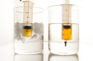
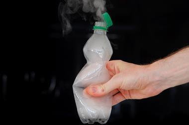
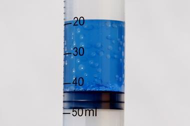
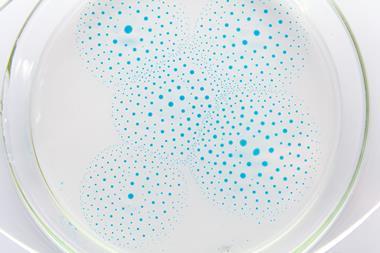
In this investigation students are asked to research how temperature and surface area affect the rate of dissolving jelly cubes in water.
What a good one looks like
For the slide, we used something which our whole school uses: a WAGOLL. WAGOLL stands for What A Good One Looks Like. It lets the pupils know what we expect of them. We use these in classrooms and we felt they are perfect to use in a homeschooling situation.
Each slide has a WAGOLL. So in this instance, I provided a research WAGOLL on a completely different topic so the pupils couldn’t just copy and paste the answers in, but it gives them a template and an idea of what we expect of them. I also provided an empty template with some research questions they could answer. With this investigation we were really keen for the pupils to do the experiments at home. We wanted them to plan for two different tests: one for temperature and one for surface area.
Recognising that some pupils may struggle to access the equipment required to dissolve jelly – timer etc – we provided them with data. They could use this data to produce some high-quality scientific graphs.
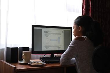
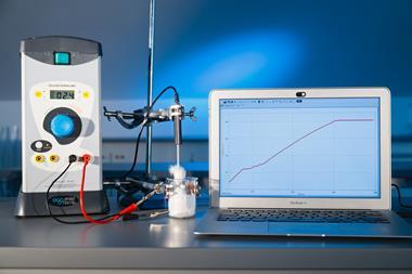
One of the biggest challenges was that we wanted pupils to make their graphs digitally. So I provided a step-by-step slide on how to produce a scientific graph, with a video of me explaining how to use Excel and how to produce a scientific graph.
Once they’d produced their Excel graph they then had to copy and paste it into the PowerPoint. The Analysis slide includes instructions on where to place the bar graph and the line graph.
On each slide, the investigation follows the same pattern: introduce a new section, so explanation, analysis and conclusion; provide written instructions and a WAGOLL. There’s also a further work section with a WAGOLL. At the end, there’s a short summary saying thank you and well done you’ve completed the investigation.
To differentiate a little and to push some pupils, we also offered them the opportunity to produce some extension work. This was based on carbon dioxide dissolving in oceans and what effect that might have on the ocean.
Structure and planning
We set the work in a very structured way on Show My Homework and on Microsoft Teams. We said things like ‘we want you to complete slides one to three today.’ This enabled pupils to plan their work, because initially we noticed some were very keen to work through the whole thing at once. But we had to bear in mind that they had other subjects going on at the same time. Of course, I think it was a good thing that they were keen to complete the whole thing in one go.
Some pupils produced some excellent work. They had gone above and beyond. Some sent pictures of them conducting the experiment. Others had done the extension work to a very high standard.
I also produced a video to show students the basics of adding work and handing in on Show My Homework and Microsoft Teams. Initially the majority of student questions were IT related, not work related, so this proved helpful. I think this was actually a credit to our work. It told me that the pupils knew how to do the work in terms of the scientific content and they were just encountering a few digital problems.
Overall we were really happy as a department with the quality of work handed in and the general engagement.


No comments yet